Hello Everyone,
First of all, I am so sorry to be so long between posts to you all. I am full of good intentions but somehow the days go by and I never catch up with myself. In some ways this is not a bad thing, as it means I am still bursting with ideas and designing and stitching as much as ever. What I then tend to forget, as I go from one idea to another, is that I have not let you people know what I am up to. So, here in this post, is a taster. I promise to try and do better.
I am getting ready for our trip to France, which leaves this coming week. All is planned ahead but, just at the minute, we cannot be sure that there will not be any problems with crossing the English Channel. We look out across this stretch of water and have locally had the problems of ‘Operation Stack’, which many of you will have heard about on the News. We are fairly used to this, I must say, but hope it will not hold us up on Friday when we take the Tunnel. Fingers are crossed.
Design and ideas
I have been busy and have somehow found myself printing on to fabric by way of my ordinary inkjet printer. I am so excited with the results that I have to share them with you.
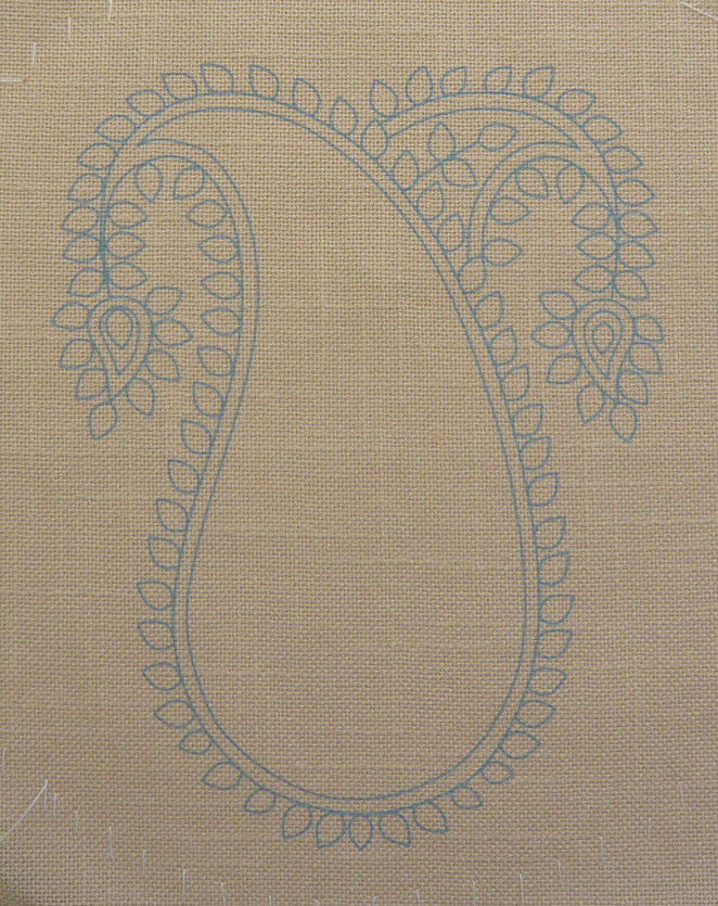
I had designed a Paisley pattern to be worked in applique and stitchery and hit the age-old problem of transferring the design to the fabric. I knew about prick and pounce, transfer pencils and water erasable pens, all of which I have used in the past and all of which have their purpose. This time though, I wanted to be able to print onto different coloured fabrics with fairly complex lines. I thought about lino-printing and sent for some equipment.

The drawing of the Paisley design. The blue area and the terra cotta area are those to be appliqued onto the background.
Then I thought about stenciling and sent for some equipment. Finally I thought (not for the first time) about printing from my HP Envy printer but had no idea how to set about it. To my aid came a book; ‘Inkjet Printing on Fabric’ by Wendy Cotterill, published by Bloomsbury. The book is full of many ideas and I recommend it for them; however, it was the straight forward approach to printing on to fabric that grabbed me. I had to try it. This time I had to send for some A4 size sticky labels (I had no idea there were such things) and then I was away. One short trial run was enough to convince me that it was worth pursuing. Some instructions for you will follow further down this post.
I had my design drawn up on Corel Draw – a programme I have been using for very many years – and had the various stages for printing sorted out. I spent a little while thinking up what colours of ink would be best on each of the coloured fabrics. The inks are, on my printer and most others, cyan, magenta, yellow and black. Please note that printing in white is NOT an option as to the printer this means no ink at all!
For the background fabric – a caramel shade of Annabelle cotton from Zweigart – I chose pure cyan at 100%. This would produce a fairly traditional form of transfer print colour and, as you can see below, worked very well.

This is how the design would look printed on to white paper.
This is how the cyan print came out on the fabric.
Next, for the dark blue fabric I thought yellow might be good but tried magenta and black as well, all on one piece of trial fabric. It was the magenta that turned out to be really good. It gave enough definition without standing out so much that, had the stitching not covered some lines, they would be visible. Later, as I stitched, it remained totally clear on the areas still to be worked. As you can see here, I was able to print three-up on an A4 sheet as the pieces were intended to be cut out and applied. I used the left over yellow and black printed areas to experiment with washing. They washed out completely with ordinary soap!
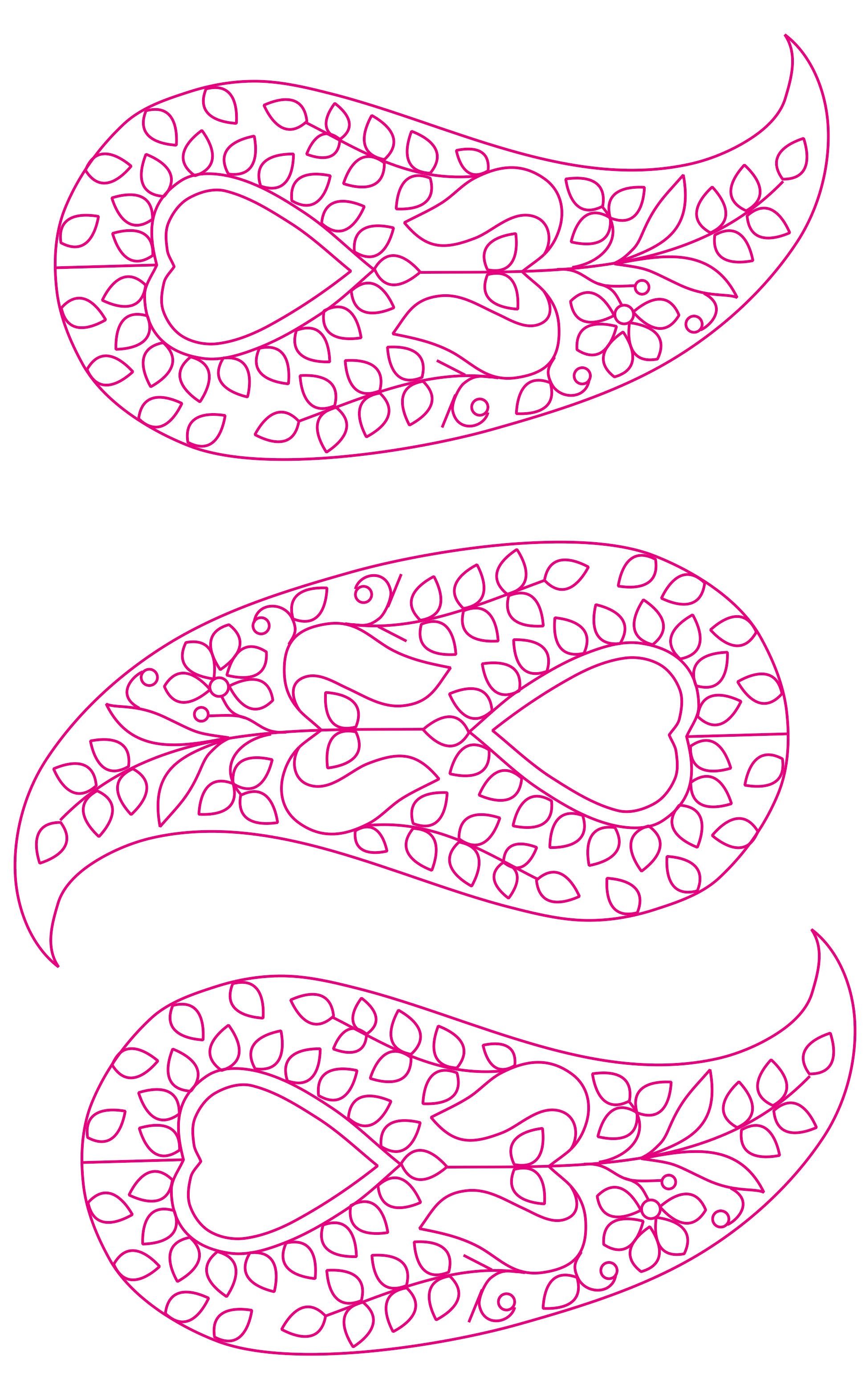
Shapes for printing shown in magenta as they would appear on white paper

Magenta print on to the dark blue fabric.
Lastly, I needed to print the upside-down heart shape that was to go on terra cotta coloured fabric. Here it seemed that the best idea would be to set the lines for stitching a shade darker than the fabric and the outer cutting line as black. Here too, the pieces could be printed several up at a time as they were to be cut out and applied on top of the blue fabric.


This also worked really well as the colour showed clearly whilst not being too obtrusive. You, of course, are not going to need a whole set of the same shape but you could paste up several design shapes, if thinking in terms of applique, and print them together. For printing the design to actually stitch you need as good a margin around it as you can.
Now I had my pieces and so applied them as required. I find applique very fiddly but decided I did need to do turnings as the raw edges, even with interfacing behind them, had proved likely to fray given half a chance. I started stitching and this part of the process and the stitches used will be made clear another time.

Partly stitched paisley design.
Incidentally, you get a much better idea of the true colour of the blue fabric here than in the earlier photograph and can, if you look closely, see the printed shapes on it. Take my word for it that they are perfectly clear whilst working.
I was able to set the colours for printing that I wanted by way of Corel Draw. If you have a drawing programme on your computer, you are likely to be able to do the same. Look at your fabric colour and choose a shade that you think will show well enough. Heavy dark lines are hard to cover and may show on the finished piece, which is a shame. When I publish some designs for you to download I will make them as suitable a colour as I can in the first place so that, provided you use a colour of fabric similar to the one I use, your design should come out very clearly.
How to do the printing
Since reading Wendy’s book I have found all sorts of instructions and variations of the method on-line and several mention freezer paper instead of labels. I used the labels and they worked well so, although I certainly will be experimenting further, my instructions here will use them.
- Take an A4 size label and cut your fabric slightly larger than the A4 sheet.
- Stick the label carefully to the back of the fabric and make sure it is straight and smooth.
- Cut the fabric to the size of the label sheet.
- Make tiny clips across the leading corners – these are the corners that will go first through your printer. Doing this can help prevent jams.
- You will need to know just which way your printer takes paper through. I place mine fabric side down and push it into position in the paper tray so that it will be picked up. It then goes round the roller and comes out with the printed side facing upwards. If your printer works differently, adjust this feeding procedure accordingly.
- Print your design.
- Remove the label and keep it to use it again (up to three times – or more).
Sources of design
For your own use you can print any design that you find in a book or other printed reference or on-line. Preferably it will be in line form with a plain white background. That way your printer will ignore the background colour and print only the image itself. Be aware that the colours will come out looking very different on a coloured fabric from how they look on white. Fairly fine lines (1pt – 3pt) work well. Thicker ones might be too much. In this case, take a tracing of the design making the lines finer and use it to copy onto the fabric piece.
I intend to publish some downloadable designs for you to use in the near future so that you can choose your fabric and instantly have your design ready to stitch. Currently I am working small designs in white thread on red fabric. I printed in cyan on it – more to follow in due course.
Fabrics
Fabrics should not be very thick or they just will not go through. As mentioned, I used Zweigart’s Annabelle for the first fabric and this is not a very fine quality; it is cotton, has a slight slub to it and is 28 count for counting purposes. It gave no problems at all. The other fabrics I used were patchwork cottons and these went through without a hitch too.
If you are stitching directly on cottons as fine as patchwork ones you are likely to need a firmer fabric behind them and to stretch this in a hoop while you stitch. Lightweight calico or similar is good. The great danger when free stitching is puckering of the fabric and these two factors – backing and hoop – will prevent this to a great extent.
Give it a try
If you have a printer, find some oddments of fabric and procure some A4 labels then give the design printing a go. Following the instructions should not damage your printer at all and it is really exciting to see these designs coming out begging to be stitched.
Further reading
Do take a look at Wendy Cotterill’s book. There are many further ideas in it for all sorts of artistic treatments and effects.

Some other books
These books have come my way recently and are well worth looking at.
Splendid Apparel. Anna Zilboorg, published by XRX Books.

If you like to knit and would then like to embellish it with stitches you must look at this book. I was very taken with the patterns for garments themselves and found myself wanting to knit them all, even without the added stitching! The instructions are exemplary for the projects and the stitches, also each section includes many other ideas for you to experiment with. The embroidery stitches follow the patterns made by the knitted stitches and change the look in the most innovative ways. You may even find yourself that you look at garments you have previously knitted and think in terms of adding to them. Many of the garments in the book are knitted in what seems to be double knitting equivalent or 4 ply yarn, which, for us in Britain, is very convenient. My personal stash includes many of these two weights. I think I might well get set up with a winter project (or more than one) to work in the evenings from one of Anna’s designs – they are so inviting.
Surface Design for Fabric. Kimberley A. Irwin, published by Bloomsbury.

When I first got this book I thought it might be for textiles students only and of little interest to those of us at home. I was wrong. Every aspect shown and discussed gives instructions for working the ideas in your own workroom, kitchen or studio. There is so much practical information that you could spend a great deal of time working your own experiments and learning a great deal. Aspects covered include Dyeing and Staining: Discharging colour and using resists: Printing and transfer: Fibre manipulation: Fabric manipulation: Embroidery and embellishment. There are so many ideas; I want to try them all!
I promise to try to get back to you all soon. Meanwhile, do look at our Facebook site, which Anne Mullender keeps up to date. She is far more efficient than I am. Go to Facebook and ask for New Stitches Magazine – it’s easy and there are offers there is more news for you. Also, do look at Stitchdirect.com . Anne sets up new offers from time to time.
Mary
